Research into font
There are 2 font styles:
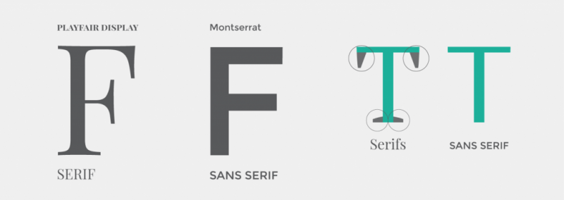
Serif's
- Serif's are the small finishing strokes on the end of typed letters.
- They are used in the majority of body texts as it makes them easy to read.
- Using serif said to be masculine as it makes the text seem bold.
- The image below explains.
Conventions

Pulp fiction is a movie from 1994 which clearly uses serif's to make the titles stand out. This was conventional within the decade.
However as seen in the Skyfall titles below, sans serif is used which makes the title look subtle. I still think the lettering looks classy even though it doesn't have serif's.


Comments
Post a Comment